I started working with data visualization during my graduate studies in engineering. I was modeling blood flow in arteries with Computational Fluid Dynamics (CFD) to visualize parameters like pressure drop or shear stress. That’s when I first got exposed to large data sets and data visualization principles.
After moving to Budapest, I became a front-end developer and was introduced to digital data visualizations. I fell in love with this field because it combines communication, design, science, and coding skills, making it a well-rounded discipline. I started learning D3.js and never looked back!
At the time, I was (and still am) also particularly concerned about how polarized our societies are becoming and by the loss of trust in science and journalism. With data visualization, I aim to contribute to educating people about complex but essential subjects while supporting organizations that make a tangible difference in our world.
The biggest strength of D3.js is that it’s not a charting library. There’s not one function to create a scatterplot and another to draw a bar chart. Instead, D3 provides low-level building blocks from which you can build any data visualization, from traditional charts to out-of-the-box graphical representations. Because charting libraries are built with specific use-case scenarios in mind, there’s generally a point where you meet limitations for how much you can customize a visualization. D3 gives you a level of control and opens possibilities that are just non-existent with other data visualization tools. Once you understand the philosophy behind D3, it becomes a one-stop shop for all your visualizations needs.
Another advantage of D3 is how it was created with web technologies in mind. It makes interactivity and transitions, two elements that are essential to modern digital interfaces, easy to create and control.
This course aims to make students comfortable with D3’s building blocks and main modules. By the end of this program, the students will be able to build their own interactive dashboards and responsive visualizations. But most importantly, they will understand the philosophy behind D3, allowing them to keep building on what they’ve learned.
We will also cover data visualization best practices with Mihály Minkó and the development environment with Nándor Dévai. This will provide the students with a well-rounded set of tools for producing data visualizations. It’s a very hands-on course where the students can learn by doing in a supportive environment. The only limitation is your willingness to get your hands dirty and code!
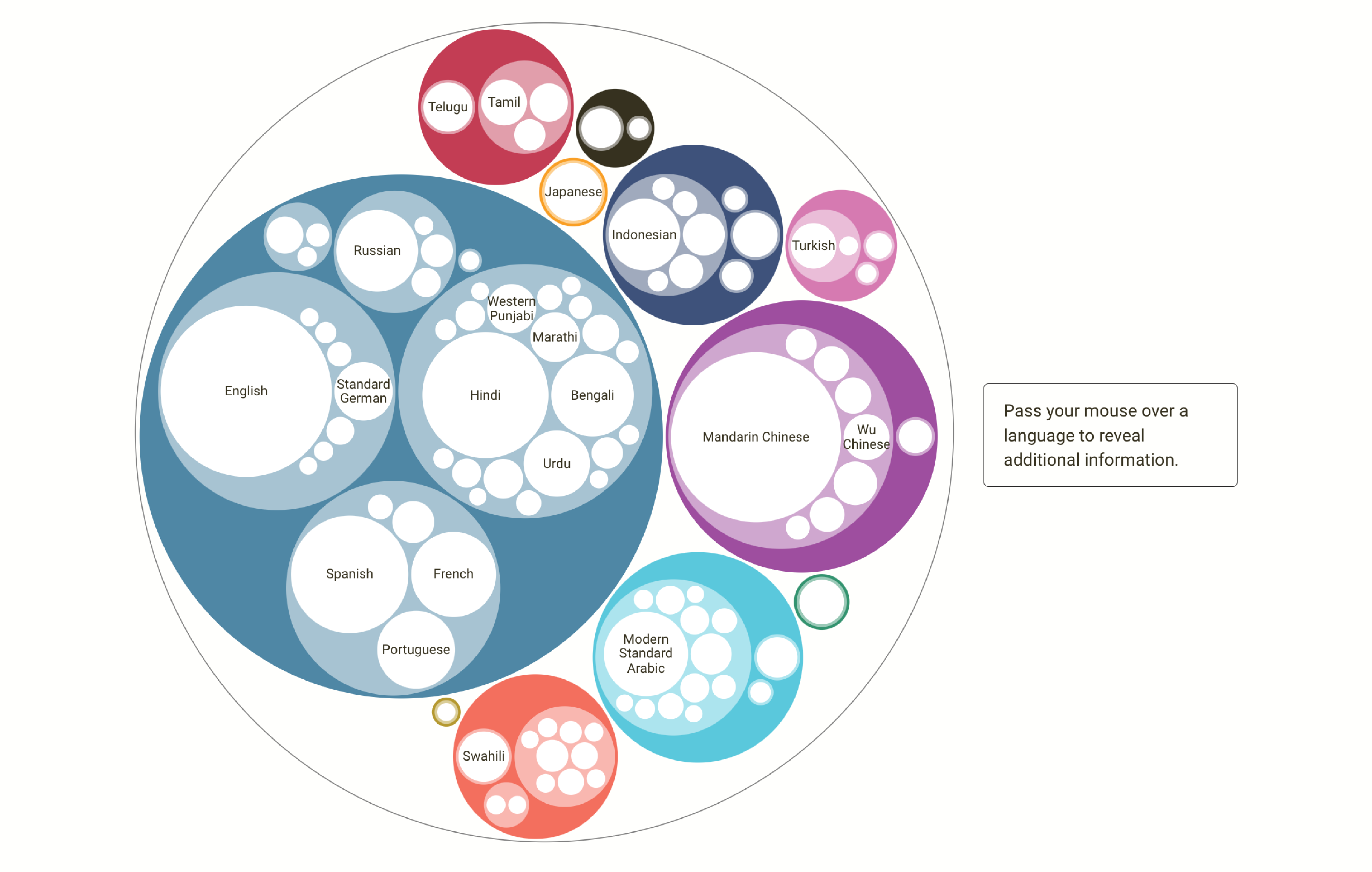
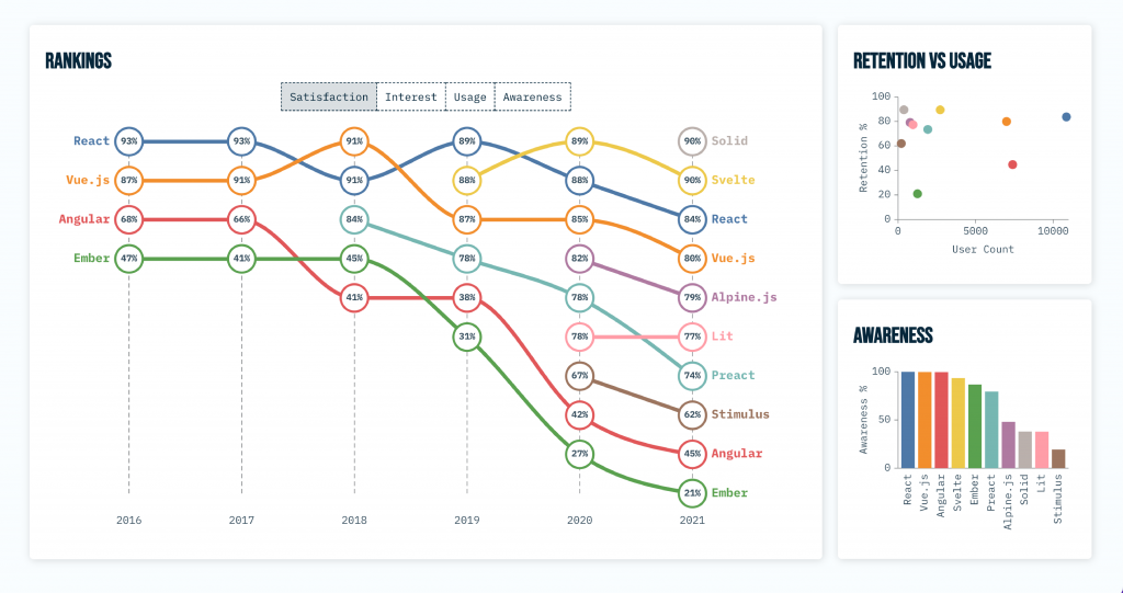
I’m proud of the data visualization exercises I built for the 3rd edition of the book D3.js in Action, like a dashboard about front-end frameworks or a set of hierarchical visualization of the world’s most spoken languages. Building exercises for students encouraged me to keep my code simple and straight to the point. I learned a ton through it.
I’m also happy that my latest project, A Decade in Review, made the World Data Visualization Prize shortlist. I can also point you to one of my favorite projects, Your Daily Foodprint. With this visualization, the users can select what they eat in a day and get a feel for these choices’ impact on the environment. Then, by making minor tweaks to their diet, the users see how much water, greenhouse gas emissions, or even money they could save. That subject is very dear to my heart, so this project, although it was one of my first visualizations, will always be special to me.
I’m currently working on a fun project about street names in the European Union (EU) in collaboration with Explained media and Inbal Rief. We are exploring the origins of these names and how EU countries influenced each other. Spoiler: France is the EU country with the most influence on its neighbors’ street names, followed by Germany and Italy!
Anne-Marie Dufour: LinkedIn | Website
If you are interested in learning D3.js, do not hesitate, apply HERE! Learn more about the Interactive data visualizations with D3.js course!
Application deadline: 10 April
Start date: 21 April